Giddy
Objective
An initiative to improve the largest sexual health platform, making it inclusive and accessible for all genders and sexual orientations. | Giddy's vision is to be the go-to destination for sexual health. It provides prompt access to informative articles and promotes exploration, breaking down stigma and creating a safe, inclusive environment for all. Giddy believes that sexual health is a crucial aspect of overall health and wellness.
My Role
Research Support
Design Lead
Tools
Figma
Screen Sizes
Desktop L, Desktop M, Tablet, Mobile L, Mobile S
Teams Involved
Design, Editorial, SEO, Marketing, Dev, Copy
Duration
2 Month Sprint
Overview
Have you ever found yourself curious about sexual health, but too scared to ask a doctor or too overwhelmed by WebMD to even try? Giddy is here to help, providing education, peace of mind, and resources for anything related to sexual health, including the ability to speak with a doctor whenever needed.
Through our platform, we have been able to provide crucial information and support to individuals who might otherwise feel too ashamed or uncomfortable to seek help. Our articles cover a wide range of topics, including sexual health, relationships, and mental health, and are written in an approachable and inclusive style. We also offer access to licensed medical professionals who can provide personalized advice and treatment options. With these resources, we have been able to help countless individuals feel more confident, informed, and empowered when it comes to their sexual health.
Despite Giddy's significant strides in the sexual health industry, our previous site was structured around a binary system, which made it difficult for all users to find content and resources, specifically to those who identified outside of that system such as the LGBTQIA+ community. Our categories were vague and confusing, preventing users from fully exploring and discovering our offerings. Through our redesign, we aimed to make Giddy an inclusive, fun, and informative platform by revamping our categories and highlighting our unique illustrations and artwork. With these changes, we hope to break down the taboo around sexual health and empower individuals to prioritize their well-being.

Research
C&C Analysis
At GetMeGiddy, we have a unique position in the market with no direct competitors. To better understand the landscape, we conducted extensive research and analyzed a range of websites, including Healthline, WebMD, Goop, and Poosh. Our research revealed that most websites if not all use a non-binary structure in their navigation, which we leveraged to our advantage when communicating with stakeholders.
Interviews
We conducted a series of email polls to gather insights on our website. We reached out to more than 100 individuals and had the chance to interview 10 people who used our website, ranging in age from 20-40. These individuals shared their experiences using GetMeGiddy.come for both leisure and for knowledge.
Takeaway
“I dont fall under male/female so I dont use the site much at all”
-Interviewee
Findings

“I tend to leave the site after what I’ve found what I’m looking for.”

“The site feels stale and dark, not somewhere I want to learn.”

“The art is beautiful but the site doesn’t refect that.”

“there’s only one specific spot for LGBTQIA+ so I don’t feel very welcome.”

“I want to learn about sexual health but not here.”

“The categories feel very broad.”
Persona

Riley Goodfellow
30 years old
Trans Man
Has a history of ovarian cancer in family
Riley is on a quest for knowledge about ovarian cancer and other health issues that may run in the family. During this search, Riley comes across GetMeGiddy.com and starts to explore the site. However, Riley quickly realizes that the site is divided into Male/Female categories and feels concerned that they may not find the information they are looking for without feeling misclassified. Despite their efforts, Riley leaves the site feeling discouraged.
"How might we design a website that transcends the binary system and prioritizes individual needs based on life stage and symptoms, and create a safe, inclusive, and beautiful environment for all genders and gender expressions?"
Design
Taxonomy
Our diligent editorial team embarked on a mission to evolve our previously binary structure into a more inclusive, non-binary system that prioritizes conditions and topics over gender. This was no small feat, requiring weeks of research and collaboration with experts to develop a comprehensive plan. The result of their tireless efforts was a beautifully crafted system that accurately reflects the needs and experiences of all users, realized through the transformation of a cumbersome spreadsheet and sitemap into a visually stunning representation of information. With a deep commitment to creating a user-centered design, our team decided to bring the non-binary system to life through a high-fidelity mockup. We recognized the critical importance of getting this aspect of the design right, as it would serve as the foundation for all subsequent design decisions and shape the overall user experience.

Sketching
Having successfully established a robust taxonomy, our team embarked on an inspired phase of ideation. This process involved generating a plethora of innovative design concepts, from which we carefully selected the most promising ideas.
Home Page
Our goal for the homepage was to create a captivating and personalized experience for our users. At the heart of the page lies a stunning, feature article that offers a wealth of information on the latest developments in sexual health and wellness. Complementing this, a curated selection of complementary articles offers further insight and guidance. As users navigate the page, they are treated to a dynamic and engaging journey, with the most popular and frequently searched topics always within reach. Personalized content, tailored to their individual preferences, adds an extra layer of relevance and excitement, while a collection of side widgets spotlight our most popular articles. With our forward-thinking taxonomy, we aim to provide a seamless and inclusive discovery journey, regardless of gender expression.

Article Page
Our article page serves as the backbone of our website, showcasing our custom illustrations, headlines, authors, and breadcrumbs. To ensure the seamless and inclusive discovery journey we established on the homepage, we also incorporate side widgets that allow users to effortlessly explore new and relevant content as they navigate the site.
Video Series
We recognize the impact of video content and its ability to simplify complex topics. That's why we made it a key aspect of our new design. With daily additions of new videos, we aimed to create a beautiful design that highlights our series and underscores the significance of video content in educating and engaging our audience however they identify.

Glossary
With our non-binary journey in place, we sought to provide a comprehensive resource for all topics related to sexual health and wellness. The result was a design to serve as a one-stop-shop for all information needs. The alphabetical menu offers a simple and intuitive navigation experience, enabling users to swiftly access specific topics with ease. Our aim was to create a convenient solution that removes any barriers to accessing valuable insights and guidance, making it effortless for users to find the information they seek. This final touch completes our commitment to creating a truly inclusive and empowering user experience.

Where We Landed
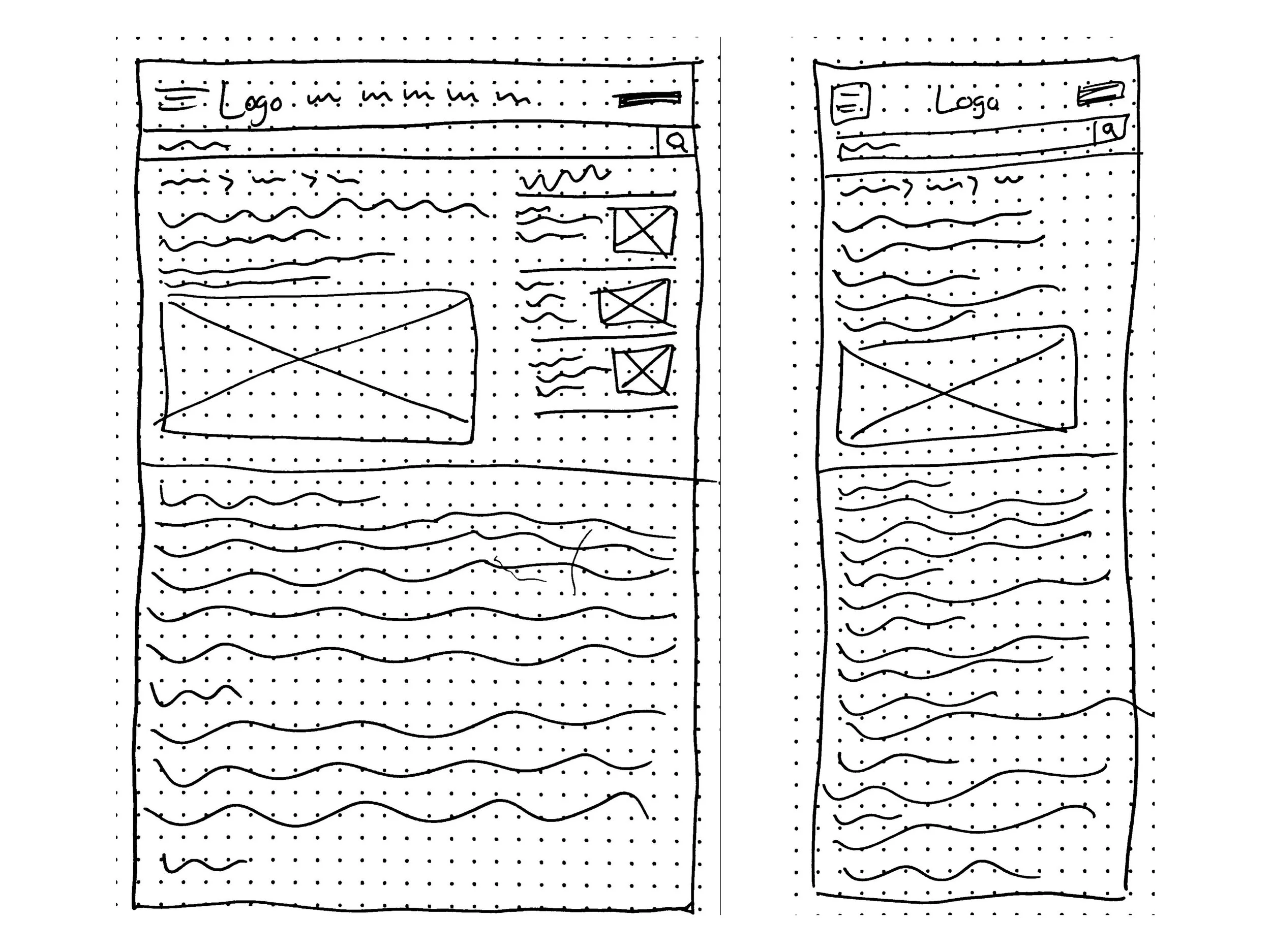
Wireframes
For the wireframe process, we went through multiple iterations until we arrived at our final design. We carefully considered the key features and user experience, resulting in three different iterations of the site. Our chosen wireframe was then translated into 5 different screen sizes, complete with detailed annotations, to ensure a seamless handoff to the development team. For this demonstration, we will be highlighting both desktop and mobile wireframes to showcase how the design translates across different screen sizes.
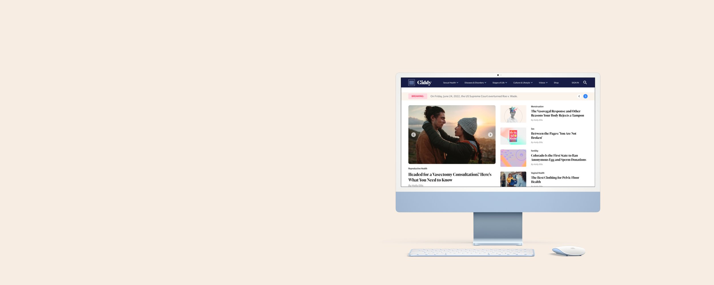
Home Page
I take immense pride in our exceptional homepage design, which masterfully blends an abundance of engaging content with a polished aesthetic, setting it apart from its contemporaries. We incorporated a Breaking News Banner, which serves to highlight relevant updates in the realm of sexual health for our users. As visitors scroll down the page, they are presented with a diverse array of content types, offering a wealth of information and captivating discoveries.
By eliminating the binary structure, we not only enhanced the user experience but also facilitated a more coherent understanding of our brand and the site's purpose. This strategic decision has ultimately contributed to our remarkable success and elevated the overall quality of our digital presence.
Article Page
The design of our article page posed a unique challenge, but also presented a thrilling opportunity for innovation. With a keen eye on diversity and inclusivity, we carefully considered a wide range of options to create a flexible and adaptable design that would accommodate an array of articles created by our talented editorial team. Our goal was to create a seamless integration of content, ensuring that any type of article would be presented in a visually stunning and engaging manner, regardless of its subject matter or format. With a design that accommodates change, we have created a dynamic platform that can grow and evolve with the needs of our users.

Video Series
We tackled the design of the video series page with a creative and innovative approach. Our goal was to introduce users to the diverse range of video series we offer, while maintaining a modern and visually appealing design. The solution we arrived at was a sleek carousel slider, featuring eye-catching posters that give a quick overview of each show. This design allows users to effortlessly navigate and discover our video content.

Glossary
The glossary remained largely unchanged throughout the transition from ideation to wireframe, with the addition of a dynamic side widget on desktop that showcases popular articles and carefully curated advertisements. This not only enhances the user experience, but also provides a convenient solution for those who may struggle to find the information they seek.

Testing
At Giddy, we continuously strive for improvement through a data-driven approach to design. Our ongoing tests, which range from ad placement and size to article layout and section arrangement, provide valuable insights into user behavior and preferences. As Giddy continues to grow and establish itself as a leading voice in the industry, we are confident that our ongoing tests will only yield more and more impressive results.
Our unwavering focus on elevating the user experience has paid off, resulting in a staggering 75% increase in conversions and engagement, as evidenced by the increased time spent on-site and click-through rates on GetMeGiddy.com. This remarkable success is a testament to the effectiveness of our research and the impact of our efforts to create a user-centric design by creating a non-binary system that can easily aid any user regardless of identity.
Next Steps

Add GiddyAI integration with a chatbot or some sort of widget.

Create more article types to further expand and improve out robust catalog.

Continue to research and test if anything else related back to sexual health can be represented or added to the site.
Key Takeaways
Allow for more time for development, there were things missed and small mistakes made in the launch that make a big impact. Our small team was put under a lot of stress and I belive there were things that suffered because of it. We needed to advocate for ourselves more.
Insights
It was so beautiful seeing how we accomplished such a huge feat. Giddy can do amazing things if it takes its time and lets itself become a force in the world of sexual health.
Challenges
Working with such a tight timeline was really tough. Thankfully we had many people to support but our team was still small but we got it done and I’m very proud of the work we did.
Favorite Step
Finally getting rid of the old binary system we had. Giddy is a very “taboo” company due to the nature of our content so this update needed to happen and i’m so glad I got to be apart of it!